I am so excited to share a little bit more of our house plans with you all. When we bought this house, Alex and I were on the same page in respect to how we’d renovate it. What we couldn’t envision on the spot was the overall design, which luckily (and rightfully so) he leaves 100% up to me.
A lot of designers will say that it’s easier to design for clients than for themselves. If I agreed with that statement, I’d have to declare that I am indecisive – which I am not. I am finding it no harder to design for myself, but what I am missing is the feedback and collaboration. I often enjoy hearing client’s thoughts on their vision for the space. Their dreams are usually my jumping off point. Perhaps I’m feeling a little less than inspired when it comes to the design, because I know it’s such a long road ahead. See, Alex is handling 80% of the renovation work himself, on nights and weekends. In our last house, he handled EVERY.LAST.BIT – BUT this new house is MUCH larger (almost twice the size). We’ve been thoughtful and strategic with what he will work on and what we will hire out. However, what he will work on will take time.
When it comes to the design work, it’s all me. Don’t get me wrong, I prefer it that way, but I’d be lying if I said it wasn’t a daunting task. Keep in mind, designing our 3,500 square foot house is something I’m doing ON TOP of growing my interiors business and living through a list of never-ending renovations. I’m not complaining; I asked for this. I just wanted to share my perspective on the situation. I guess, in short, since interior design is my profession, designing my own home feels like work. Again, don’t feel sorry for the little designer who has to struggle through her dream…she’ll be fine. 😉
Anyway, onto the concepts I’ve landed on for each room…
Since I’ve only share my ideas for our first round of renovations, which will be completed this spring, I’ll continue to share parts of the story in pieces. Yes, I already have the kitchen designed in my mind, but we’re not there yet. Baby steps, people!
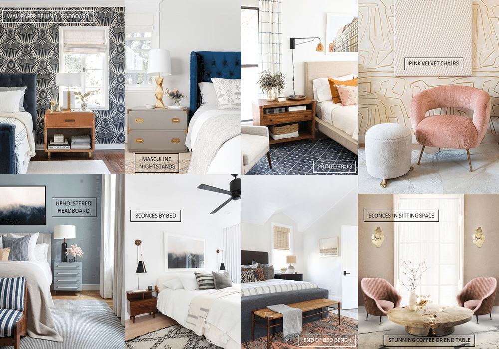
MASTER BEDROOM
Guys, we’ve never really had a master bedroom. When we lived in apartments, we had small spaces that served several functions. In our last/first house, we had a nice-sized space, but no walk-in closet, sitting space or attached bathroom. In this room, we have ALL THREE!!! We’re calling it the MASSIVE MASTER. Now, we didn’t just get lucky with that. We were “gifted” with this really awkward hall outside of the bedroom that we essentially converted into a the walk-in closet of our dreams. It’s BIG, people, and I’m flipping out.
I’ve always lived in (and loved) old homes. Anyone who has one knows that this almost guarantees that you will be lacking on closet space. Tiny closets have been my life for the last 28 years. Will I refer to time in the future as PWIC (post walk-in closet) and look back on the bitter memories BWIC (before walk-in closet)? We’re taking “new year, new me” to a whole other level here.
Anyway, let’s talk design. What am I thinking for this space? WELL I’m glad you asked! I want this to be a space that both Alex and I can enjoy – aka not too feminine. While I’d love an exploded floral wallpapered accent wall, I can save that for the guest room. This space will speak to both of us.
I’m dividing this room into what I call “the sleep space” and “the sitting space.” The sleep space will feature all your normal bedroom bits – (upholstered) bed, (leather?) nightstands, (woven?) bench, (printed) rug, etc. There’s a half wall that separates the two rooms, so the other side will we more of a “get ready” or reading space. It’ll have a pair of pink velvet chairs (I think…) and a banging coffee or end table. Perhaps it’ll get dolled up with a vintage vanity and Moroccan rug. Pipe dreams, people.
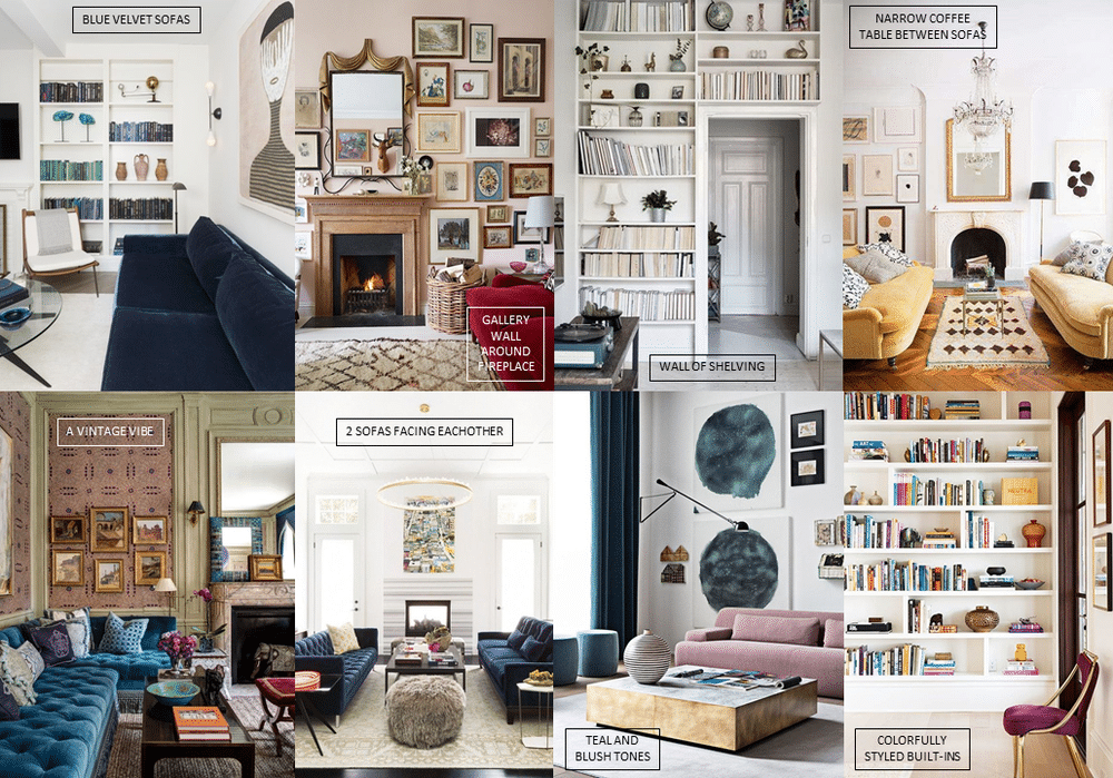
LIVING ROOM
We’re working with a really large living room here, people. See, the house is nearly double the size of our old one – but we don’t have many more rooms – just bigger ones. Luckily, I think I have this room worked out from a floor plan standpoint. This living room is going to be a little different from the others I’ve designed in the past. To start, we’ll need to bring in two matching sofas. They will face each other and live on opposite sides of the fireplace.
On the fireplace wall, we plan to build a GIANT gallery wall. We’re talking about the mother of all gallery walls here, guys! All of my artwork has been living in boxes since the move and I am so excited to have it back out.
The living room already has two great built-in shelving units by this sweet set of French doors, so you know those are going to get SERIOUSLY STYLED UP! I plan to have this space be heavy on the vintage items. Of course, I have a lot of artwork and decor that fits into this category, but I also have a great teal desk and cream cabinet that will live in here. I also plan to hunt down the world’s most amazing mantel. Know a guy?
Other than that, I want to get some soft pink tones in here. Currently, the walls are a Pepto-pink shade – which is going! BUT…I’m thinking I want a soft blush rug to break up the blue velvet.
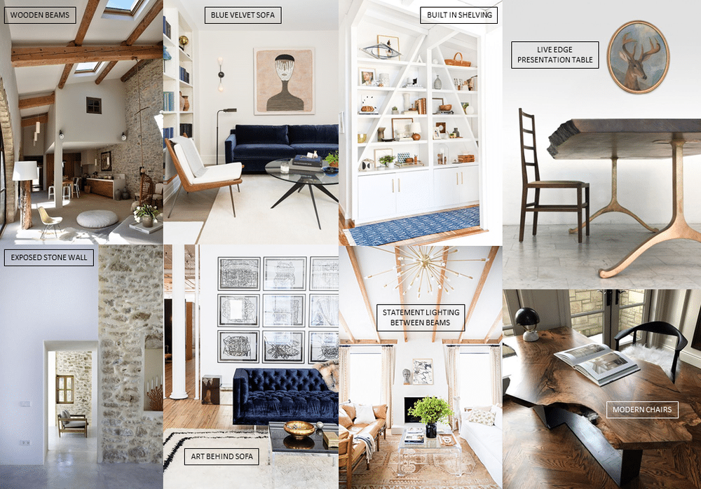
STUDIO SPACE
I saved the best for last. We still have a lot of decisions to make on this space, but it is BY FAR the room in the house that I am most excited about. In our last house, I turned a spare bedroom into a bright work room. In our new space, the previous home owners actually did us a favor by ripping out a wall that separated two bedrooms, creating a larger one. Now, I say ‘favor’, but I use that term lightly. They removed a load-bearing wall and left us with a ceiling shaped like a bowl.
I am happy to report that the ceiling has since been removed. Our original plan was to just replace it. Obvious right? Well, as we opened it up, we revealed access to a portion of the attic space above. I’m not big on dedicating rooms to solely store stuff you never use (hello holiday decor), so I was pleased as a peach to NOT add a ceiling back in. We now have a vaulted ceiling that reaches the third floor. In this process of demolition (thanks, Alex), we also unearth a stone wall. Now, I don’t mean to make us sound like total novices here; we knew this all existed. However, it wasn’t until we (Alex) started ripping things apart until the full potential was realized.
This space is going to take me out of my comfort zone a bit – as the exposed stone isn’t totally my style. Don’t get me wrong, I love old stone homes – which we have – I just don’t know how I feel about it in the bright and bubbly room I envisioned. Needless to say, the inclusion of stone totally shifted my design plans for this space. I had this bubblegum pink wallpaper picked out, which would look HORRIBLE with the stone. I really don’t know if any wallpaper would work with the stone (*gasp*) so I may just have to pick paint. Either way, I was always planning to bring in a live edge presentation (essentially dining) table and a blue velvet sofa. I may need to find clever ways to make this space a tad bit more colorful, but here’s where we are for now.
If you got to the end of this post, I salute you. Seriously, HATS OFF – this was a meaty one! I’d love to hear your thought so far – sound off in the comments.


"*" indicates required fields
We typically send these fun little nuggets of info out once per month. We love sharing design tips, travel ideas and our favorite local spots!
"*" indicates required fields